Fintech / 2026
iCredo
A loan you ask for the way you would ask a friend - and understand before you say yes.
Որքա՞ն գումար է քեզ պետք
1,000,000 դրամ
Ընտրեք, թե ինչպես եք ուզում հաշվարկել վարկը՝
iCredo is a mobile lending app for Credo Finance, an Armenian consumer-credit company. Instead of a form, the product opens with a small red robot that asks how much you need, listens to what it is for, and comes back with the offer that fits - then verifies your identity, pays the money out and stays with you as the loan is repaid. Discovery, calculation, KYC, repayment and account status live in one guided flow.
My role. I was the product designer from the first workshop to the component library: product strategy, the conversation model, every core flow, the interface, the design system and the mascot. Copy was written together with the credit team, because the assistant's words are the product.
The constraint I designed around. Consumer credit in Armenia is a last-resort category with an annual rate ceiling of 58%. I could not make the loan cheaper, shorter or less serious. What I could change was whether a person understood what they were agreeing to before they agreed to it.
Outcome
Nine fields became one question, and nobody had to be brave to ask
- question per bubble. The assistant never asks two things at once - that single rule did more for comprehension than any screen I drew
- 1
- hand-offs from chat to controls: amount, monthly payment and identity. Precision where precision matters, conversation everywhere else
- 3
- moods the mascot carries - approved, sorry, confused, under maintenance - so outcomes arrive with a face instead of a status code
- 4
The web calculator that Credo Finance ran before this project asked for everything at once and answered with a monthly payment. iCredo asks for one thing, explains why, and answers with the best offer and the reason it is the best. The same components carry the person from the first bubble to the last repayment, and the mascot carries the feelings the system would otherwise put into error codes.
The financial context made clarity non-negotiable
Problem
The scariest conversation in finance
Asking for money is the moment people feel most judged. Credo's web calculator answered that moment with nine fields, one button and zero explanation.
Most of the people this product was for had never borrowed online, and every one of them had a private reason for needing the money. The product still had to collect detailed personal and financial information - regulation does not care how you feel about it.
So the brief was not to make the form shorter. It was to make every question feel deliberate, explainable and polite, and the answer feel like advice, not a verdict. A form has no sequence, no tone and no way to say why. A conversation has all three.
Signature interaction
A conversation when context matters. Controls when precision matters.
The assistant asks for one decision at a time. The moment an answer has to be exact - an amount, a monthly payment, a document - the chat hands over to chips and inputs, then takes the thread back. Every screen below is the shipped Armenian interface, rebuilt in code from the design file so you can watch it think. Tiran is the customer in every prototype; Credo is the assistant.
- 01
Where it started: nine fields and a button
Credo's web calculator was correct and complete and nobody finished it. It asked for an employer before it asked what you needed the money for. Reconstructed here from memory - there is no design file for the before.
Վարկի հաշվիչ
Համաձայն եմ պայմաններին Համաձայն եմ տվյալների մշակմանըՀաշվել - 02
One question. Then quiet.
Credo, the assistant, asks the only thing that matters first: how much. Then it asks how you would rather think about the loan - by monthly payment or by term - as two chips, not a paragraph.
ԿրեդոՈրքա՞ն գումար է քեզ պետք
Տիրան1,000,000 դրամ
ԿրեդոԸնտրեք, թե ինչպես եք ուզում հաշվարկել վարկը՝
Ըստ ԱմսավճարիԸստ ԺամկետիԸնտրեք կամ մուտքագրեք - 03
It asks how you think, not what it needs
By monthly payment means you name the amount you can live with each month and the assistant works out the term. The number goes into a real input with quick amounts, because a bubble cannot validate zeros.
Ընտրեք, թե ինչպես եք ուզում հաշվարկել վարկը՝
ՏիրանԸստ ԱմսավճարիԴուք նշում եք, թե որքան գումար եք պատրաստ վճարել ամեն ամիս, և մենք հաշվարկում ենք՝ ինչ ժամկետով և ինչ պայմաններով կարող եք ստանալ վարկը:
ԿրեդոԸնտրեք կամ մուտքագրեք, ձեզ հարմար առաջնային ամսեկան վճարի չափը:
Տիրան50,000 դրամ
50,000 ֏100,000 ֏250,000 ֏500,000 ֏Մուտքագրեք վճարի չափը - 04
The loan in five lines, before you sign
Amount, term, monthly payment, loan type and the real annual rate on one card. Three consents tick, and only then does Apply turn blue. Nothing is hidden in a footnote.
Վարկի գումար:1,000,000 դրամԺամկետ:24 ամիսԱմսական վճար:47,073 դրամՎարկի տեսակ:ԱնգրավՓաստացի տոկոսադրույք:12% տարեկանՓոխել գումարըՓոխել ժամկետըՓոխել տեսակըԴիմել - 05
It checks, and says that it is checking
The credit-history check takes a few seconds. The screen says so, shows progress, and keeps the logo in the middle so the wait feels like the product working, not the product freezing.
Ստուգում ենք քո վարկային տվյալները
Կատարում ենք վարկային պատմության ստուգում: Սա կտևի ընդամենը մի քանի վայրկյան
- 06
Verification you can watch happen
Photograph the ID card, see it accepted, watch the security ring move from 1/3 to 2/3. It is not invisible. It is understandable, which in this category is better.
1/3ID քարտ
Լուսանկարեք ձեր ID քարտը և համոզվեք, որ բոլոր տվյալները հստակ տեսանելի են:
Հաստատել - 07
The loan stays legible after approval
My Loans turns the commitment into a workspace: status, remaining balance, progress, next payment and a repayment button on one card - and a plain red line when a payment is late.
Տեսակավորել: ԲոլորըԱնգրավ վարկN00101984Ակտիվ էՄնացել է:847,300 դրամՀաջորդ վճարում:47,073 դրամ / 25.05.26Վարկի ՄարումԱպառիկN00097412Ակտիվ էՄնացել է:236,500 դրամՀաջորդ վճարում:39,400 դրամ / 10.05.26Դուք ունեք ուշացումՎարկի ՄարումԱնգրավ վարկN00081153Մարված էՎարկը մարված է:500,000 դրամՄանրամասներ
Why this is not a chatbot bolted onto a bank
Conversational interfaces fail when they behave like forms wearing a costume: three questions in one message, a wall of text, a typing indicator that hides a database call. People skim and answer the wrong one.
I wrote a hard rule into the conversation model: one decision per bubble, never a second question before the first is answered. The assistant's copy was cut until every message fit in three lines on a small phone.
A lender's data model starts with amount and term. A person's starts with 'what can I pay each month'. The old calculator forced the first on everyone.
The second question is a choice of mental model - by monthly payment or by term - and the rest of the conversation follows the one you picked. The maths adapts to the person, not the other way round.
My first prototype let people type an amount into the chat. They typed 100000 when they meant 1,000,000, and the assistant cheerfully priced the wrong loan.
Anything that must be exact is a control: quick-amount chips, a formatted input, a document frame. The chat frames the question; the control takes the answer; the chat confirms it back in a blue bubble.
Consumer credit hides its price in schedules and footnotes. People sign a monthly payment and discover the annual rate later, from a relative.
The summary card puts amount, term, monthly payment, loan type and the real annual rate in five lines, and the three legal consents are checkboxes you tick yourself. Apply only turns blue after the third.
Most lending flows end at approval. The relationship ends there too, and every later question becomes a phone call.
The same component system continues into My Loans: balance, progress, next payment, repayment actions and the schedule, in the same language the assistant used on day one - including a plain red line when you are late.
Asking for money is the moment people feel most judged, and a photographed loan officer carries that judgment into the interface. Error states written by the system - 'request failed', 'invalid input' - make it worse at the exact moment trust is thinnest.
The red robot fronts every outcome. It celebrates an approval, apologises for an error, thinks through an unclear answer and wears a hard hat during maintenance, so the product speaks with a face people already smile at.
Trust
Verification you can watch happen
Identity checks are where people leave. Not because the check is hard, but because they cannot see where they are in it or what happens to the photo they just took.
So the KYC flow shows its work: what is being requested, what has already been completed, and how far the security ring is from full. I did not try to make verification invisible. In a last-resort lending product, invisible reads as suspicious. Understandable reads as safe.
The fail
My first assistant talked too much. I let it.
I was in love with the idea of a conversation, so the first prototype conversed. It welcomed you. It explained the company. It told you what it was about to ask before it asked it, and then asked it, and then confirmed that it had asked it. Four bubbles before the first question. I showed it to a colleague who reads faster than anyone I know, and I watched her scroll past all of it and tap the input.
The second lesson was worse. When the amount was typed into the chat as free text, a participant wrote a number with the wrong count of zeros, the assistant priced it happily, and she only noticed at the offer screen. She laughed. I did not.
Both fails became the two rules the product still runs on: a bubble is for one question and nothing else, and a number is never a bubble. The welcome speech was cut to five words. The amount got a real input with formatting. The assistant became a lot quieter, and the conversation became a lot better - which is a note I have since applied to myself in meetings.
Prototype validation
What the first usability sessions were built to break
Can a chat make required questions feel clearer than a form? I watched for whether people understood why the assistant was asking each question, especially at the moment the conversation moved from a casual amount into personal details. The tell was hesitation: a pause before income was the signal that the 'why' sentence was missing or too long.
Can a person enter a number with confidence? The design pairs an open amount input with quick amount choices and repayment modes, so nobody has to invent the interaction model themselves. I counted corrections - every time a participant went back to change the amount was a point against the input.
Can a person understand an active loan at a glance? The post-approval workspace puts status, remaining balance, progress, next payment and repayment actions on one card. The test was a single question: 'when is your next payment and how much?' - answered without scrolling, or not.
These are the hypotheses the prototype was built to test and the design responses to them. The documented session notes are the next thing to add to this page.
The face
Why a mascot? A face for the scariest conversation in finance
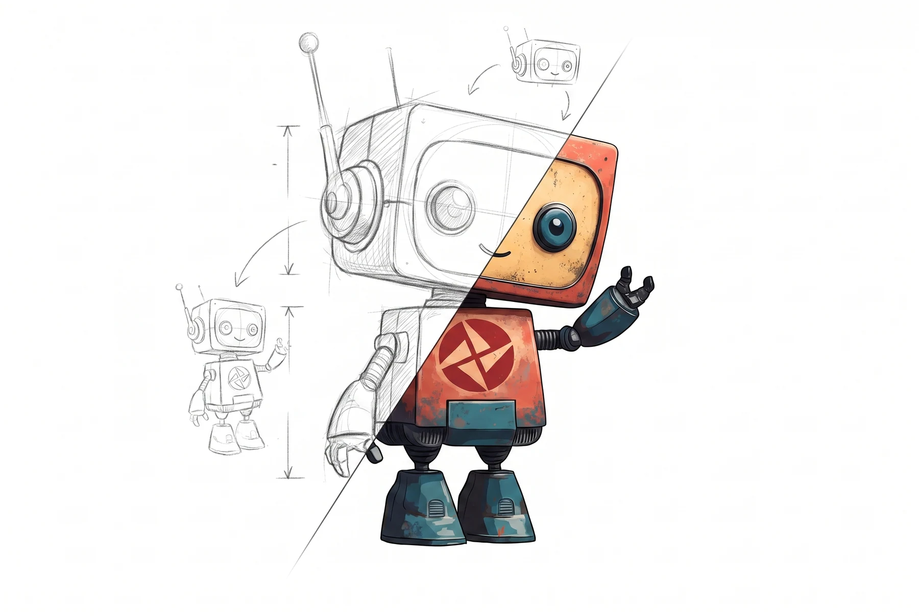
Asking for money is the moment people feel most judged. A human loan officer - even a photographed, smiling one - carries that judgment into the interface. The mascot removes it: nobody feels evaluated by a small red robot. It turns an interrogation into a guided conversation and gives the assistant a consistent, recognisable presence across the whole product.
The mascot also does functional work. It carries the app's emotional states - celebrating an approval, apologising for an error, thinking through an unclear answer, wearing a hard hat during maintenance - so the product can communicate outcomes with feeling instead of system jargon. In a category where trust is the whole battle, a character users smile at is not decoration. It is the trust mechanism.
For the record, the first version looked like a fire hydrant with anxiety. The construction sketch below is where it started to become someone.




The mark arrives before the first question does.
A lending assistant asks people to trust it in the first ten seconds, and the first of those seconds happens on the home screen, next to every other app they already trust. So the mark is built to hold at icon size: four blades 90° apart, every edge landing on one of three circles, nothing fine enough to turn to mush at 60pt.

Four blades, 90° apart. Every edge lands on one of three circles.
A system for a product that keeps growing
Grey bubble asks, blue bubble answers - the two colours are the whole grammar.
One question per bubble, three lines at most.
Chips for choices, an input for numbers, the chat confirms both back.
Name labels so a screenshot still reads as a conversation.
One document per screen, one sentence of instruction.
A dashed frame shows where the card goes before the camera opens.
The 1/3 → 2/3 → 3/3 ring says how much is left, not just that something is loading.
Confirm stays grey until the capture is accepted.
One card per loan: name, status pill, remaining balance, progress bar, next payment.
Green means on track, grey means finished, red text means late - no other colours.
The primary action is always the same button in the same place: repay.
Details live one tap deeper, never on the card.
A loan has a dozen numbers; each screen shows the one you decide on now and keeps the rest one tap away.
Labels are plain Armenian, never the credit team's vocabulary.
One blue for actions, one green for progress, one red for the logo and lateness.
8px spacing grid, 12px radii, 15px body - the same rhythm from first bubble to last repayment.
Business context
Credo Finance's stated goal is to give consumers a personal approach and flexible, convenient services. The product direction translated that goal into a mobile flow people could understand before they committed.
Reflection
The right interface does not make the decision disappear
Borrowing is personal, consequential and sometimes stressful. I did not try to design that away. I gave people a calmer way to ask, a clearer reason for every question, one honest recommendation instead of a menu, and a place to keep track of what they had agreed to.
If I did it again I would put the 'why' sentences in front of the credit team on day one instead of week three - that is where the real product decisions were hiding. And I would keep the robot. The robot was right.
The strongest next step is to replace the validation hypotheses above with the documented session notes and a proper before-and-after of the calculator.