Insurance / 2025
LIGA Mobile
The insurance app you hope never to open, redesigned around the ten minutes when you have to. That work exposed a wider gap: the app also had to help people complete a policy sale.


 32
32

Insure
 Car
Car Travel
 Health
 Home
Home Register an accident
 Claim a payout
Contracts


LIGA Mobile is the customer app of Liga Insurance, an Armenian insurer. It holds every policy a household has - compulsory motor liability, casco, travel, property - and it does the two things a policy document cannot: it registers an accident from the side of the road, and it tells you where your claim is without a phone call.
An insurance app is judged on one day, and it is not the day you buy the policy. Nobody opens one for pleasure; every session is an errand or an emergency. The old app was built for the errand.
My role. I led the redesign end to end: the product map, the claim and accident flows, every screen, the component library and the Armenian interface copy. The claim states were written with the settlement team, because the words in that timeline are the product.
The constraint I designed around. Compulsory motor liability is bought by people who did not choose to be customers, and used by people who are having a bad day. I could not make an accident pleasant. What I could change is whether a person standing next to a damaged car knows exactly what to do next, and whether the claim they file comes back approved instead of suspended.
On the numbers above. Those are the product’s reach, not this redesign’s result. What the redesign itself moved is further down, and measured.
The redesign
The claim left the call centre and moved to the side of the road
The redesign started with the moment a policy document cannot handle: an accident at the roadside. It became the lens for rebuilding the rest of the app, including the policy journeys that had to work before and after that moment. The evidence comes after the flows it explains.
Filing a claim
BeforeCall the hotline, wait in a queue, and describe the scene to a stranger who asks the same nine questions every time.
AfterFour steps answered standing at the car, each one saved the moment it is finished.
Knowing where the claim is
BeforeCall and ask, and hope the person reading the database field says something you can act on.
AfterFive states on the claim itself, each with the date it was entered, and a plain sentence whenever an expected date moves.
No signal at the roadside
BeforeStart again later, if the photographs are still any use by then.
AfterThe report opens offline, keeps the photos on the device, and syncs when the network comes back.
Problem
The worst ten minutes of your year, on hold
A claim used to start with a phone call from the side of a road, and continue with a queue, a reference number by SMS, and two weeks of not knowing.



 Image guide
The old journey was not badly designed. It was not designed at all: an app to view policies, and a hotline for everything that mattered. The moment a person actually needed the insurer, the product handed them over to a queue and a stranger who asked, in order, for the same nine things every time.
Two things went wrong there, and both cost money. People described the accident instead of documenting it, so the file arrived incomplete and the claim was suspended for missing data. And once it was in, nobody could see it, so they phoned to ask - which is how a settlement department ends up spending its day reading statuses aloud.
Signature interaction
The accident report, taken standing up
Four steps, in the order a person can actually answer them, with the camera guided before it opens, every step saved as it is finished, and the whole thing able to start with no signal at all. The screens are rebuilt in code from the design file so they play rather than sit still; the shipped interface is Armenian, and the real exports are further down the page.


 Download application
- 01
The two verbs, above everything you own
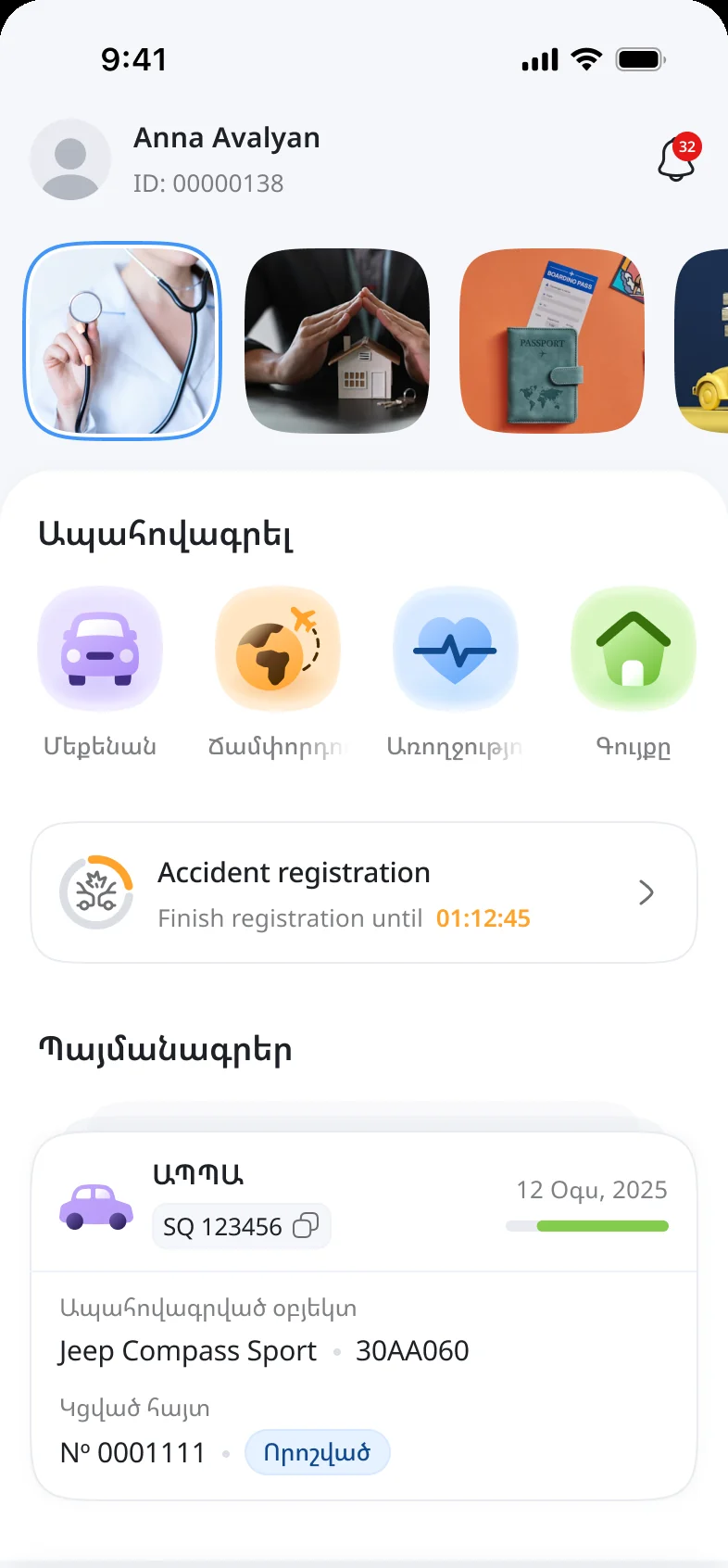
The old home screen was a list of policies. This one puts the two things a person actually opens the app to do - register an accident, claim a payout - in a block of their own above the contracts. The paperwork is still there, one scroll down, where paperwork belongs.
Anna AvalyanID: 0000013832 Insure
CarTravelHealthHomeRegister an accidentClaim a payoutContracts
CMTPLSQ 123456 12 Aug, 2025Insured objectJeep Compass Sport 30AA060Attached claimNo 0001111 Decided - 02
It has to work where the signal does not
An accident happens on a road, and roads are where the network is worst. So the report opens offline. The app says so in a sentence rather than a spinner, keeps the photos and the answers on the device, and gives three hours to submit once there is signal again - long enough to drive out of the gap, short enough that the photos still describe the same scene.
Offline accident registrationThe device is not connected to the internet network now. Please make sure to submit the accident case within 3 hours after taking photos. Otherwise, you’ll need to discard them and restart the process.
CancelConfirm - 03
Photograph the positions, not the dent
People photograph damage. Assessors need both cars where they stopped, from one position - the shot that proves what happened. So step one asks for one to four photos of the mutual positions and shows an example of exactly that before the camera opens.
Register accidentStep 1/4 · Accident photos Photos showing mutual positions of the two vehicles involved in the accident
Tap to take photos1-4 photo · Max 5MBImage guideContinueAt least one photo must show vehicles entirely from the same position as shown in examples below:
- 04
When and where, without typing
A date-and-time wheel and a location picker, because a keyboard is the wrong instrument for a wet phone held in one hand. Both fields are required and say so immediately, instead of accepting an empty report politely and failing later.
Register accidentStep 2/4 · Date and location ContinueDate and timeLocation - 05
Their document, front and back
ID card or driving licence, whichever the other driver has on them, photographed both sides, with the document number and a phone number under it. These are the fields whose absence suspends a claim two weeks later, so the app insists on them now, while the other driver is still standing there.
Register accidentStep 3/4 · Guilty car Take a photo of the registration certificate
Select the document type you want to attachFrontIf the picture is bad please retake itBackIf the picture is bad please retake itContinueAttached document numberPhone number - 06
Then yours, in the same shape
Step four is step three again, with your own document. Identical layout on purpose: by now the person knows what the screen wants, and the last step takes a fraction of the time of the first. The button at the bottom is the only one in the flow that does not say Continue.
Register accidentStep 4/4 · Innocent car Take a photo of the registration certificate
Select the document type you want to attachFrontIf the picture is bad please retake itBackIf the picture is bad please retake itComplete applicationAttached document numberPhone number - 07
It ends with a sentence, not a number
The confirmation says what happened and what happens next in one paragraph, and offers the filed report as a document. The claim number is there, but it is not the message - a reference number is not reassurance.
Application successfully createdYour car accident application has been successfully created and is now under review. You will be notified once further action is required
Download applicationApplications - 08
A claim that explains itself
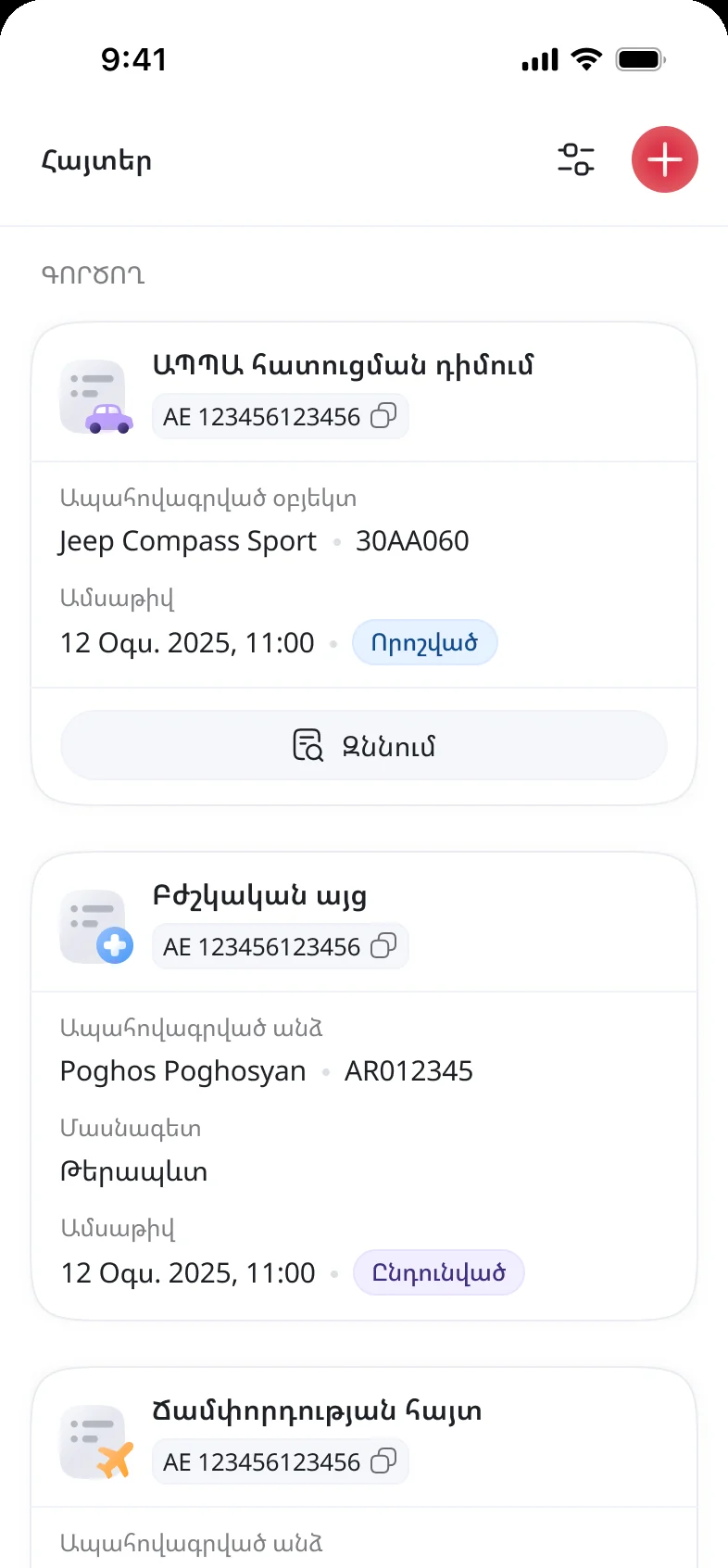
Received, accepted, inspected, decided, paid - each with the date it happened. When the expected date moves, the app says so, with the new date and the reason, which is the single question the hotline used to answer all day.
Claim status CMTPL claimAE 123456123456Claim stage
Received12 Aug, 2025Accepted12 Aug, 2025InspectedExpected 18 Aug, 2025DecidedPaidExpected date has been postponed by 3 daysDetails
Accident date08 Jun, 2025Name / surnamePoghos PoghosyanWhat service do you needRepair at a partner service
Why this is not a policy PDF with a login
Insurance apps are organised around the company: products, policies, documents, profile. That map is correct and useless at the moment a person opens the app with shaking hands.
The home screen is organised around the two things a person actually opens the app to do. Register an accident and claim a payout sit in a block of their own above the contracts; everything the company cares about is one quiet tap deeper.
Most suspended claims are not fraud or disputes. They are photographs of a scratch, taken from six inches away, that prove nothing about who hit whom.
The rule and the example come before the camera: both cars, one position, one to four photos. The step validates that something usable is there rather than accepting an empty report and failing the person a fortnight later.
A roadside is not a place where forms get finished. The police arrive, the cars have to be moved, the other driver wants to talk, the battery is at four per cent.
An unfinished report parks itself on the home screen with the time left to complete it and resumes exactly where it stopped, so an interruption costs nothing and the claim still gets filed.
"Where is my money" is the most expensive question in insurance: it is asked by phone, repeatedly, by someone who is already unhappy, and answered by a person reading a database field aloud.
The claim carries its own five-state timeline with dates, and when a date slips it says so in a sentence. The status is the product's answer, not the call centre's.
Cover lapses because an end date lives in an email from last year. Uninsured driving is a fine at best, and at worst it is the accident above with no claim at the end of it.
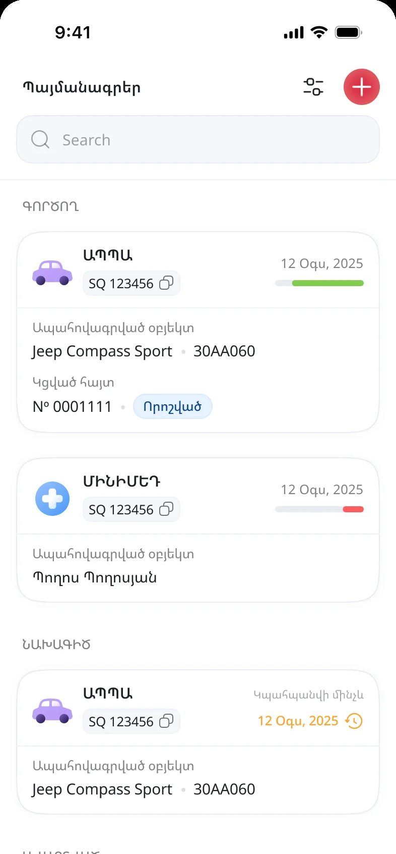
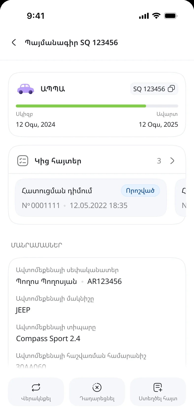
Every policy carries a bar from start date to expiry, the bar turns red in the list while there is still time to act, and renewal sits on the policy itself rather than in a menu.
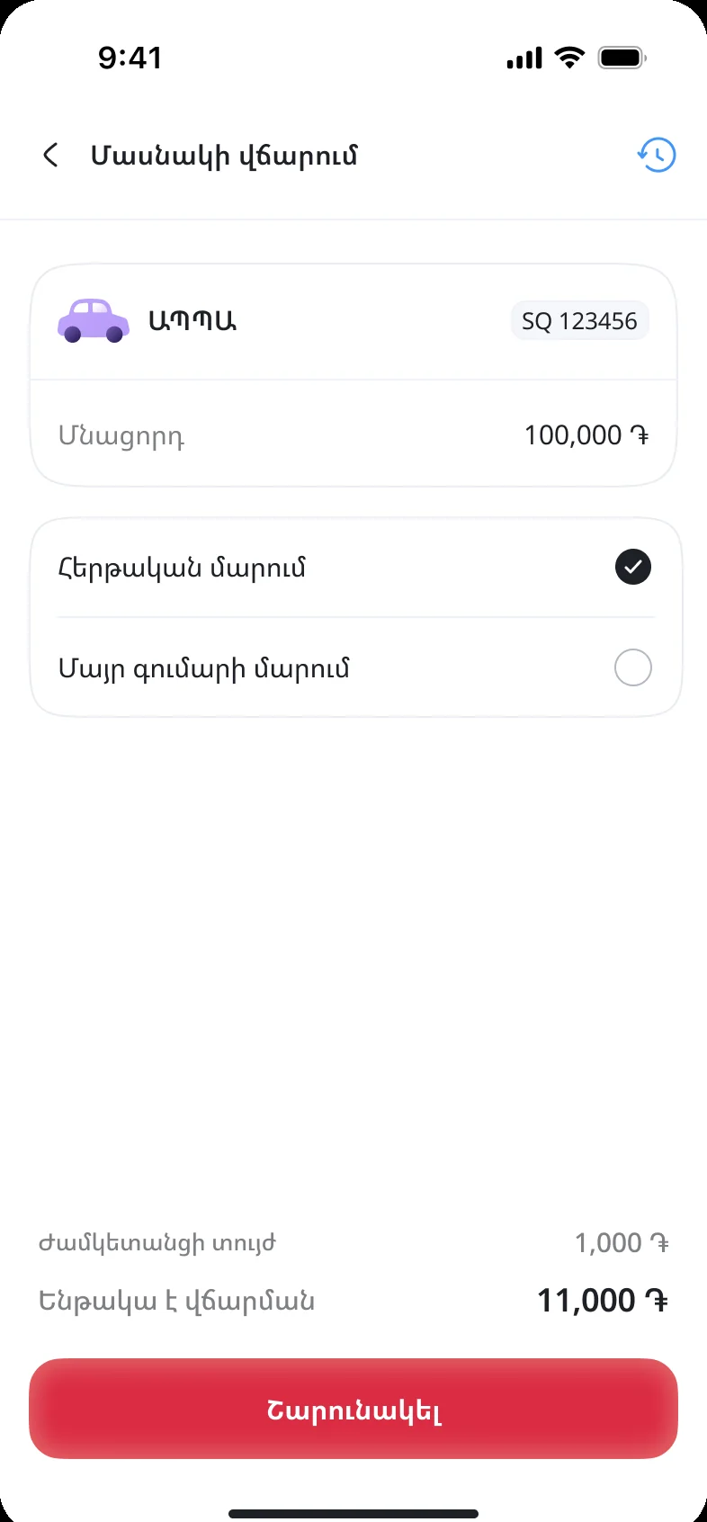
Premiums are paid in instalments, and an instalment somebody cannot pay in full quietly becomes a lapsed policy - the worst outcome for both sides.
Payment offers the scheduled instalment or a payment against the principal, with the service fee and the total shown before they commit rather than after.
The fail
My first version was designed for a calm person
The first accident flow was one tidy screen. Every field visible, nothing hidden, a single confident button at the bottom - the kind of form that wins arguments in a design review because you can see the whole thing at once. At my desk it took about ninety seconds to fill in.
Then I tried to imagine filling it in while standing in the rain, holding the phone in one hand and my own documents in the other, with the other driver explaining loudly whose fault it was. The form was fine. The situation was not. One long screen means one long scroll, one wrong tap loses the lot, and nothing is saved until the end.
Breaking it into four steps made it longer on paper and far shorter in practice, because each step is one question, each step is saved, and the flow can be abandoned and picked up again. The lesson I keep from it: the test for an emergency screen is not how fast it goes when everything is fine.
Prototype validation
What the prototype was built to break
Can a person file a usable report one-handed, standing up? The test is not time to completion but completeness: does the file that arrives contain the four things an assessor needs, without a follow-up call. I watched for hesitation at the photo step, which is where a person decides whether the app knows what it wants.
Does the interruption really cost nothing? Every session was interrupted on purpose - phone locked, app killed, a call taken mid-step - to see whether the report came back and whether the person believed it had.
Does the status answer the question, or provoke the call? The measure is whether someone reading the timeline can say what happens next and roughly when, in their own words. A status that needs explaining is a status that generates a phone call.
These are the hypotheses the prototype was built to test and the design responses to them. Documented session findings belong here in their place.
The other 364 days
The quiet half of the product
Between accidents, the app is an errand: what do I own, when does it end, what do I owe, what happened to that claim. The same components answer all four.
A system built for one bad day and many dull ones
Five states, one order, never reworded: received, accepted, inspected, decided, paid.
Every state carries the date it happened, not just the fact that it did.
A moved date is always explained in a sentence, never a code.
Status colour is a label, not decoration: blue in progress, green settled, amber delayed.
Every camera step shows an example before it opens the camera.
The rule is written in the words of the task: both cars, one position.
Documents are always front and back, in that order, in one card.
An empty required step fails at the step, not at submission.
One card per policy: class, number, vehicle, dates, progress.
The bar runs start to expiry, so cover is a length and not a date to remember.
Expiring turns red in the list while acting is still possible.
Renewal and termination live on the policy, never in a settings menu.
Reflection
You cannot design away the accident
Nothing in this app makes a crash less unpleasant. What it can do is remove the second disaster - the one made of missing photographs, suspended files and unanswered phone calls - and that turned out to be almost entirely a design problem rather than an insurance one.
The decision I would defend in any review is making the home screen boring on purpose. Everything grey except one button reads as an under-designed screen for about a second, until you imagine the person it is for.
What I would do differently: get the settlement team into the room in week one rather than week four. Every genuinely good decision in the claim timeline came from someone who had spent a year answering that phone.